Case study
Helping SMEs manage payments
About Backbase
Backbase helps banks worldwide with their digital transformation — using their out-of-the-box digital banking solutions optimized for retail banking, SME banking, wealth management and insurance-specific scenarios. With offices in almost every continent, Backbase is a key player in the fin-tech industry, powering over 120+ financial institutions all over the world.
My role
Within the SME banking team, I led the design of their mobile payments experience — ensuring the solution was flexible enough to cater for multiple customer segments and banking regulations in different regions.
I spearheaded continuous optimisation of the app, including a redesign of the core experience, drove research and discovery of our users, their needs and supported product expansion into South Africa.
In the wider design team, I worked to upskill designers on the ins and outs for native mobile design. I held workshops, provided guidance and assisted in weekly critiques to elevate and transform the thinking when it came to designing for mobile. Alongside other senior designers and engineers, we collaborated to build a mobile design system from the ground up for the entire company & it's clients to use.
Design responsibilities
iOS & Android design, Prototyping, Motion + transition design & Asset exports.
UX & Experience responsibilities
Journey mapping, User flows (Happy + sad paths), Information architecture & Accessibility compliance.
Research activities
Competitor analysis, Customer interviews, Persona creation, User testing + facilitation, Affinity mapping & A/B testing.
Team activities
Stakeholder management & workshops, Weekly critiques, UI Library maintenance, Mentoring designers, Sprint planning, Refinement sessions & Retrospectives.
Tools
Sketch, Abstract, Jira, Confluence, Miro, Invision & Flinto.
Outcomes
25% Time saved
On average, customers using the app spent less time on bookkeping tasks and managing payments.
8 Months average MVP
Banks took 8 - 12 months to digitally transform their SME app using our solution.
3 Continents serviced
Our app and payments solution could be easily scaled and configured for Europe, North America & African regions.
>85% Users remained active
At Mauritius Central Bank, most users who used the app logged in on average 14 times a month.
Takeaways
01.Separate needs for banks and customers
Customer analysis
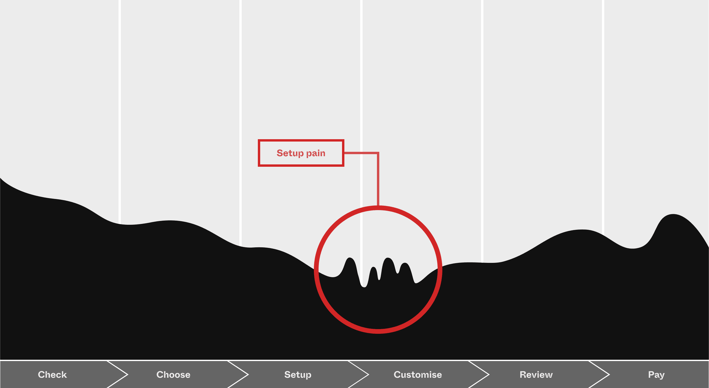
Pairing with researchers, we conducted extensive interviews across the Netherlands to understand payment workflows businesses have adopted and how that differed between roles. We also took note of what was working and their pain points.
Payments deep dive
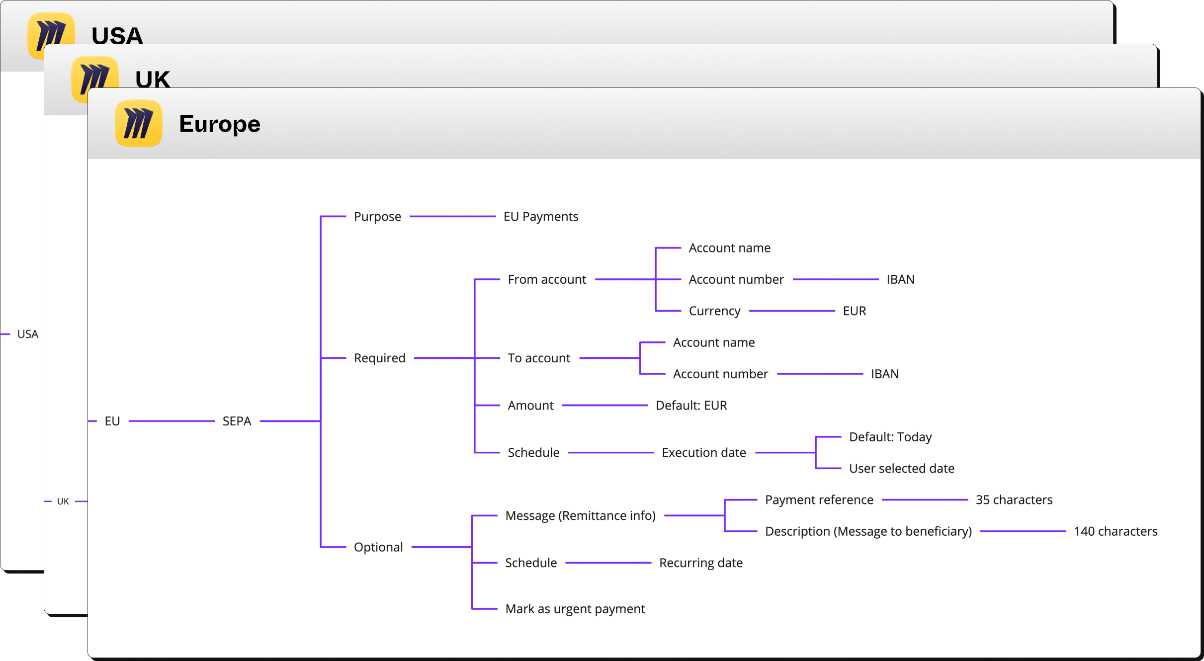
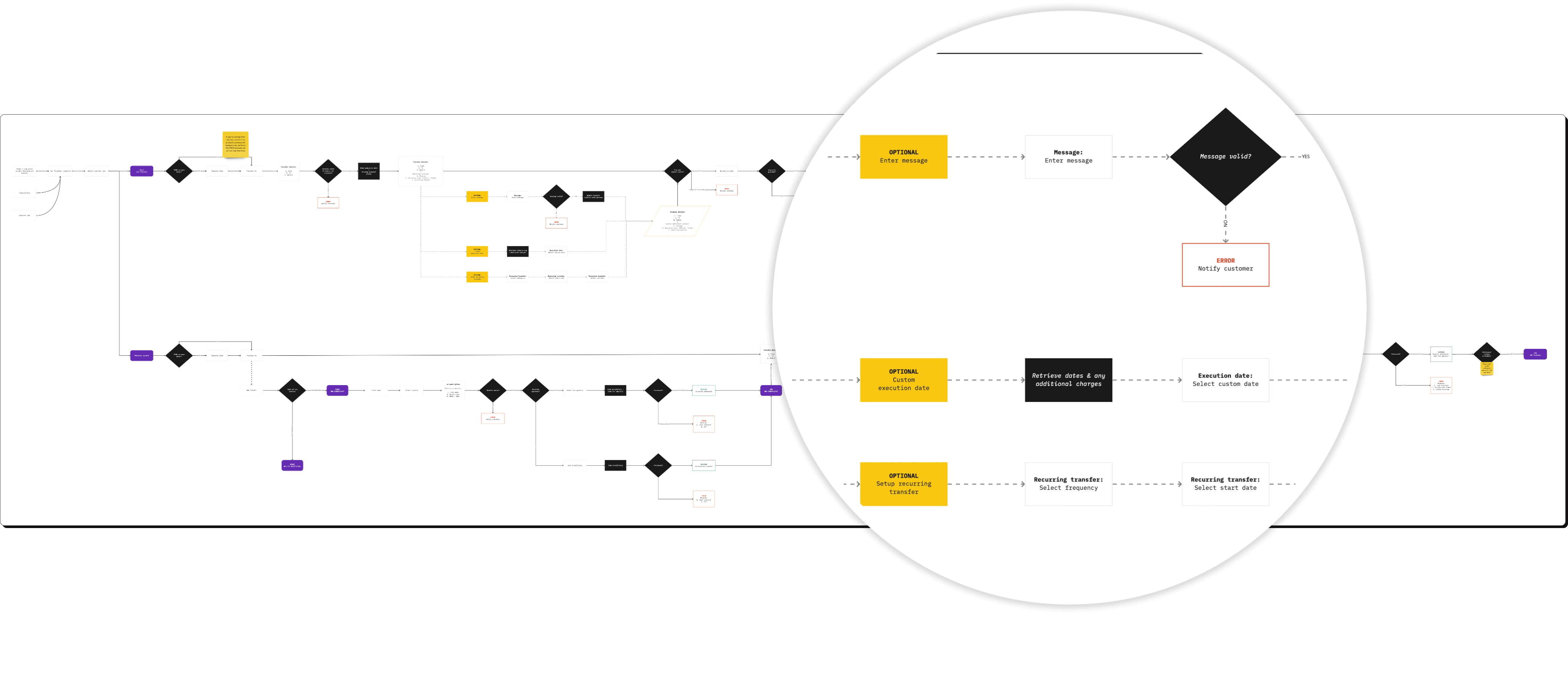
In order to help customers route money more efficiently, we had to understand how payments worked across regions, the legislative requirements each country had and how core banking systems managed these payments.
Mind mapping allowed us to identify patterns and visualise decision trees better.
Built to scale
Connecting weekly with product managers, business analysts in the field, solution architects & engineers allowed us to pair a modular user experience driven by reusable components to address the dynamic nature of multiple payment types.
This gave banks the flexibility to create custom payment flows or leverage our out of the box user tested flows — cutting their development time and allowing them to focus on their customer needs.
02.Looking end to end
Visualising balances
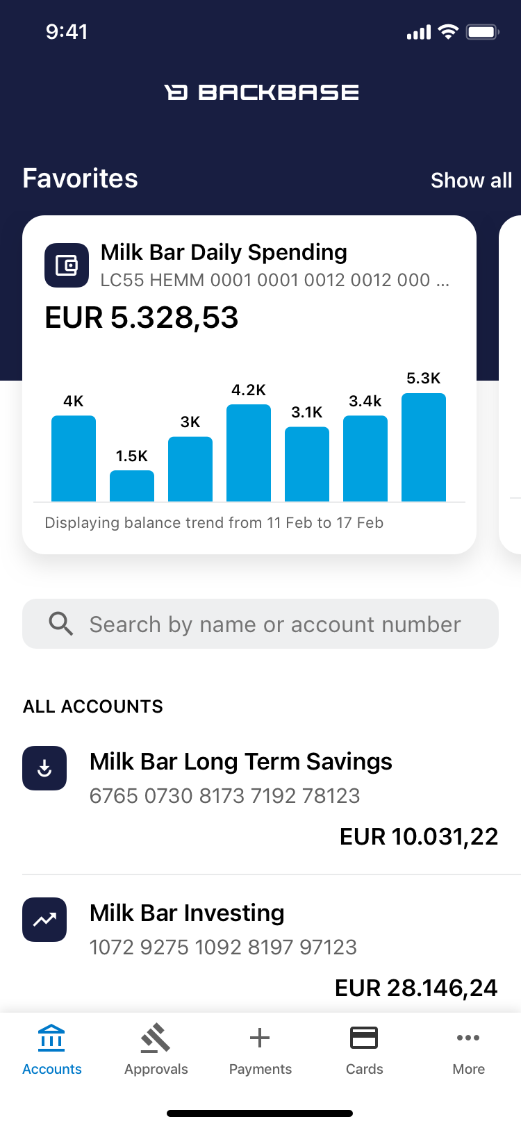
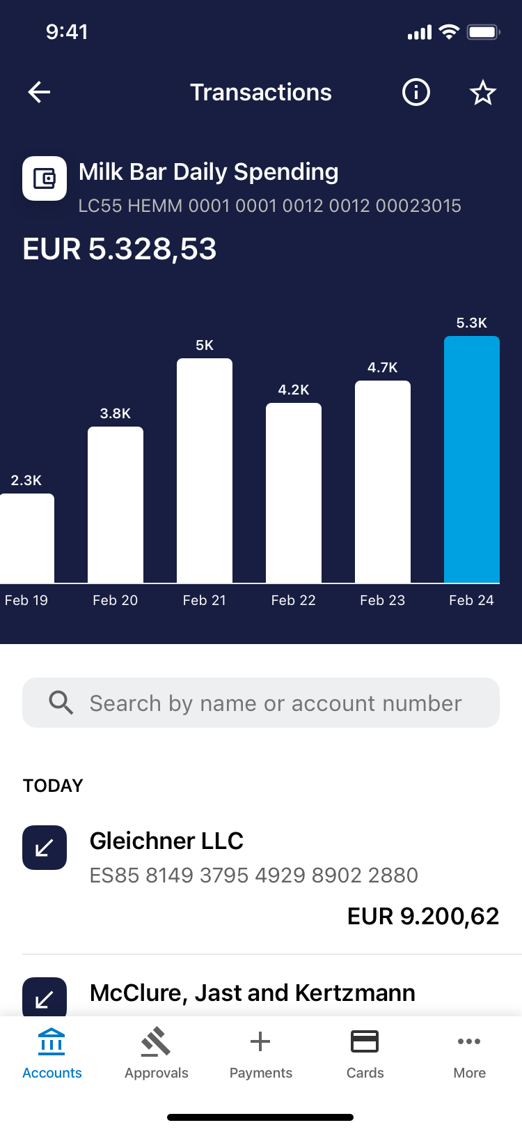
Our SME app had a list of accounts, but it lacked a snapshot of a businesses important accounts. As part of payments, we improved this screen and introduced a way for customers to favourite accounts and visualise their balance trends, increasing their confidence executing payments.
Outgoing queue
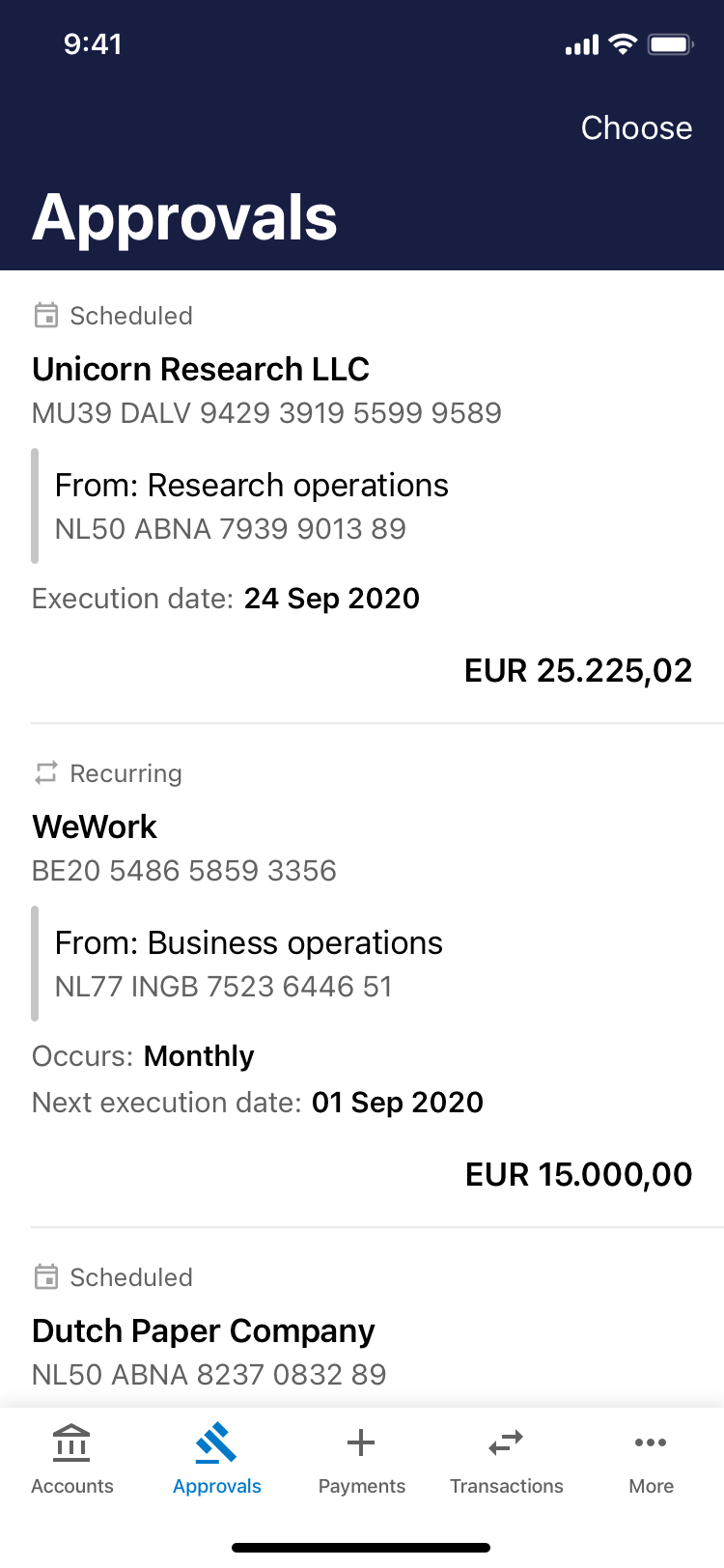
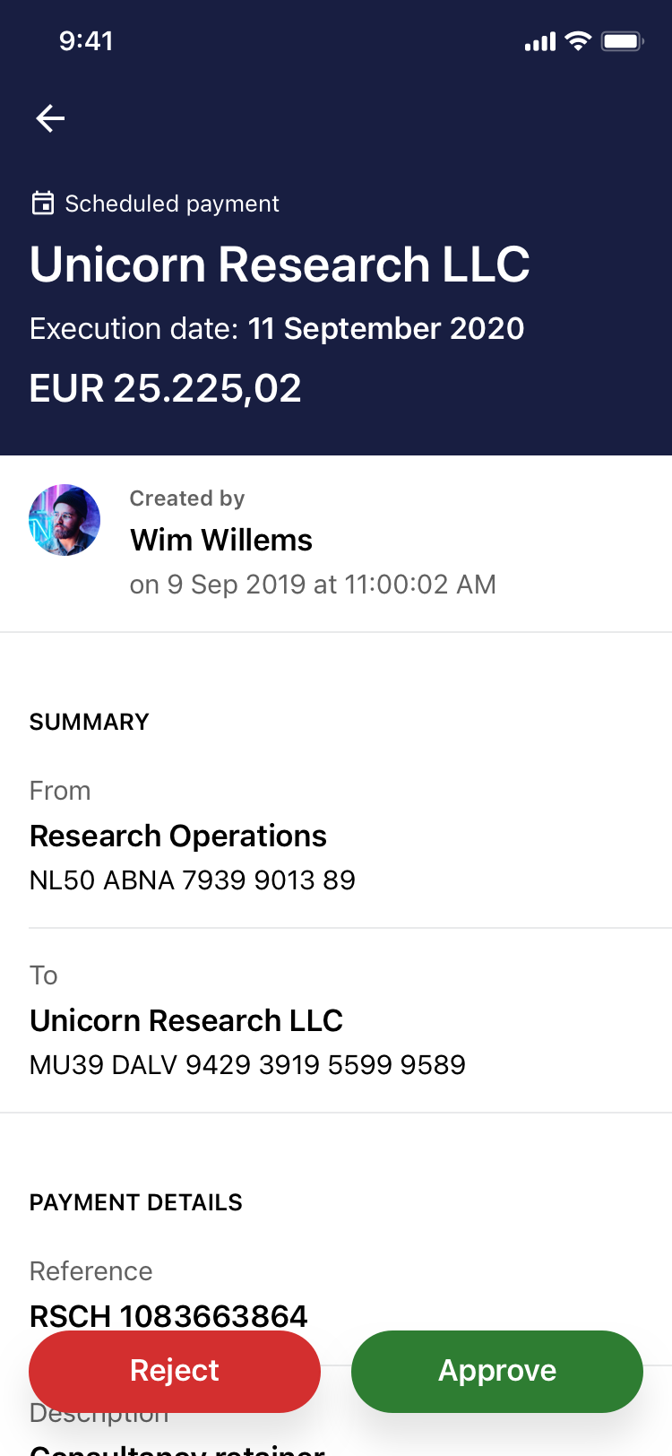
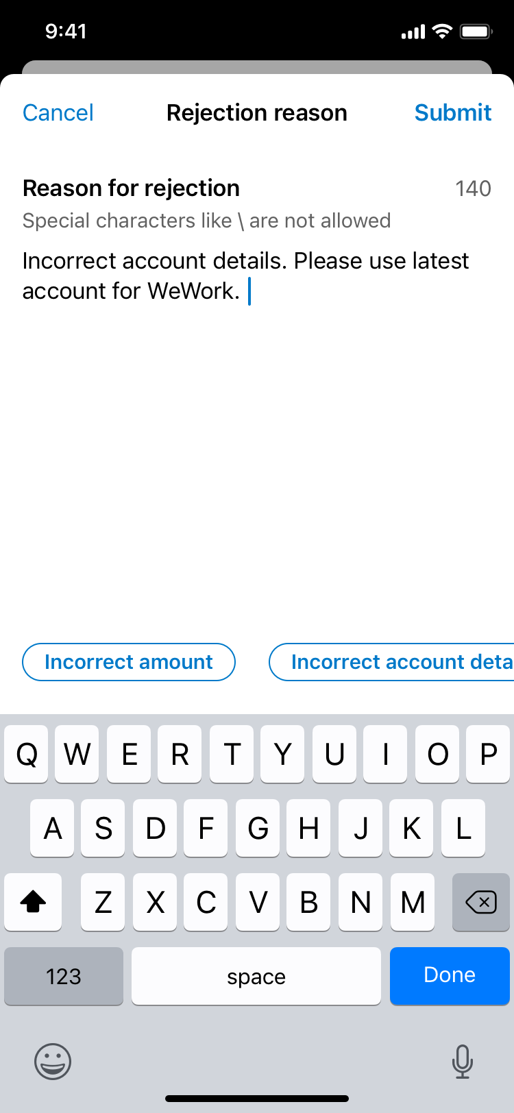
Moving money confidently requires a visualisation of what's outgoing. The ability to review scheduled payments, avoid double ups and approve or reject them was central for larger businesses. Without this queue, managing payments on the go wouldn't be as efficient as we envisioned.
03.Set aside time to test & learn
Tapping early adopters
Rolling out this solution across multiple regions meant we'd need a frequent feedback loop from our partners. Taking our partners Allied Irish Bank (AIB) & Mauritius Central Bank (MCB) along for the journey, we tested implementation with their engineers and UX flows with their customers.
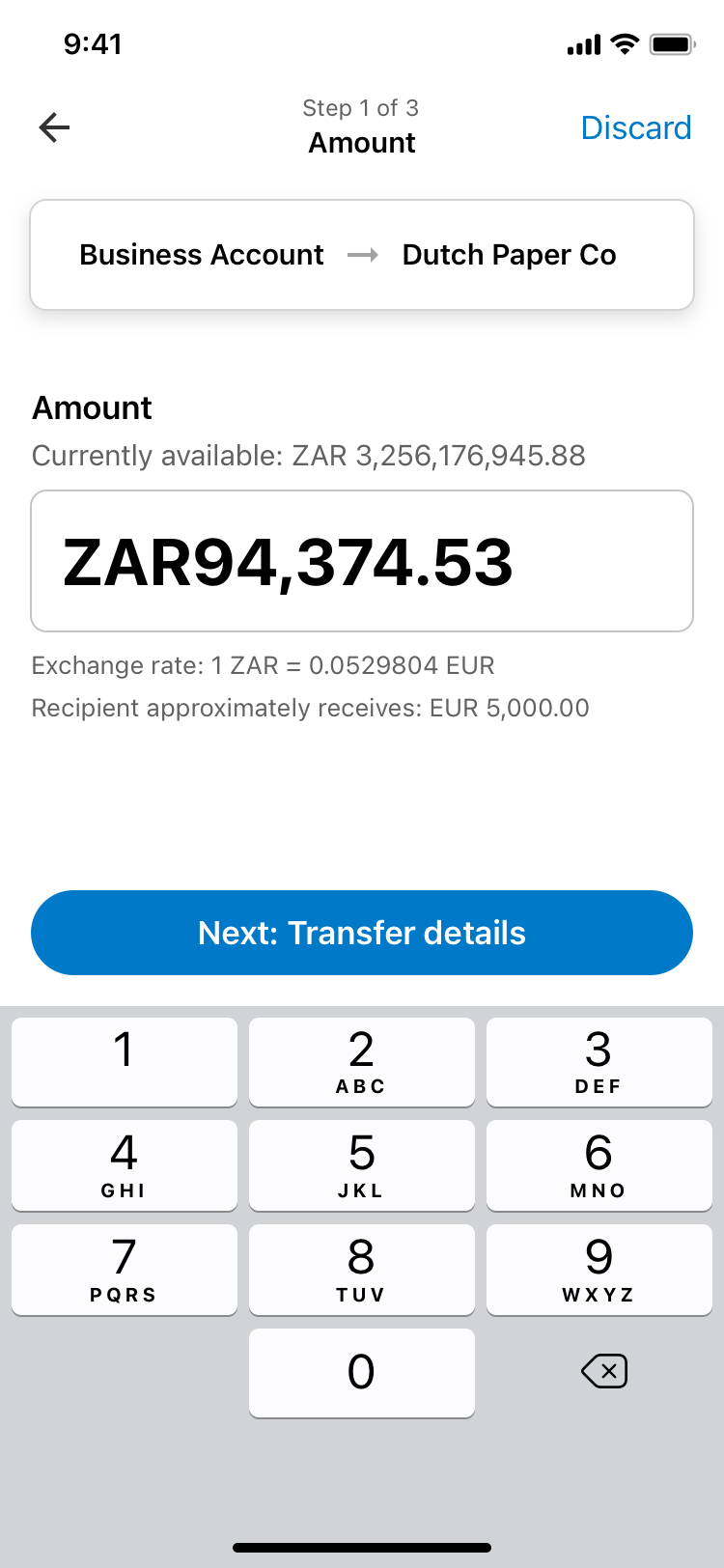
We observed in Mauritius that our amount textfields had to support larger amounts due to currency valuation differences. For Irish markets, we noticed that customers were used to sensible description defaults applied for them automatically. In South Africa we learnt that most payments required an OTP code for fraud prevention.
Strategic aha moments
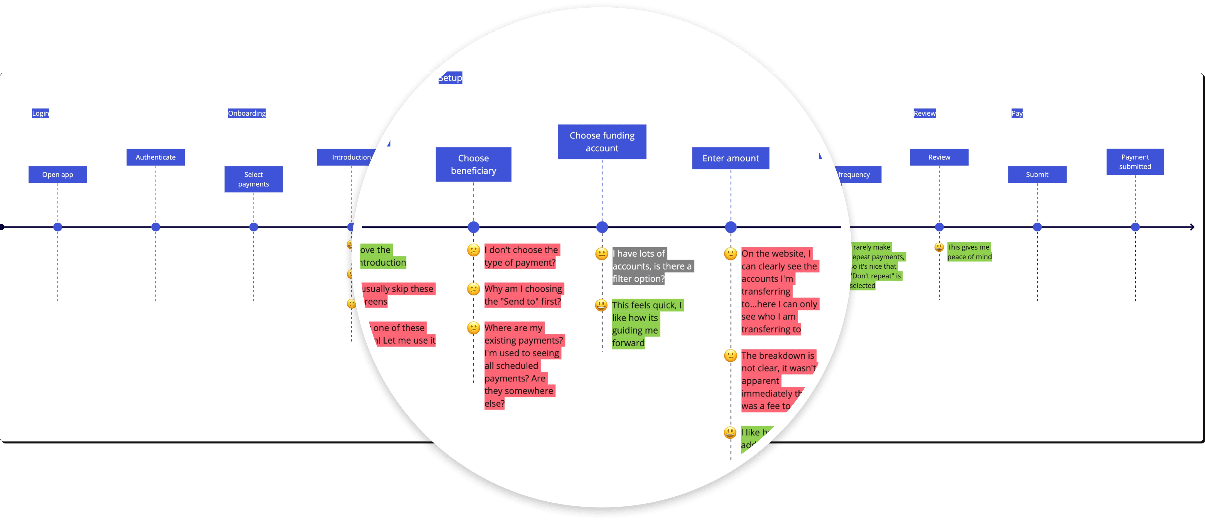
Synthesizing feedback with researchers and mapping them to our journeys gave us the ability to cherrypick strategic wins over tactical ones. This meant we could maximise the time we had fixing things that mattered the most to banks and their customers.
04.Smart design framework
Helpful hints & cues
Learning from interactions in bank branches, we wanted to provide customers with the same helping hand when making payments regardless of how seasoned they were.
This meant creating patterns that allowed us to call out key information at the right time and assist with any hiccups as much as possible.
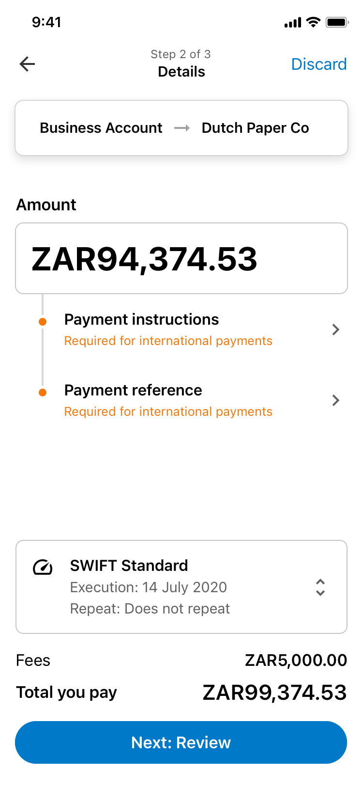
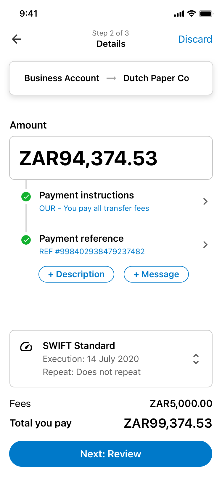
Reducing overload
Business owners are seasoned multitaskers. Mapping their mental models allowed us to design a progressive flow — rooted in common themes we identified. They could step through or pick up where they left off without having to worry about losing their bearings.
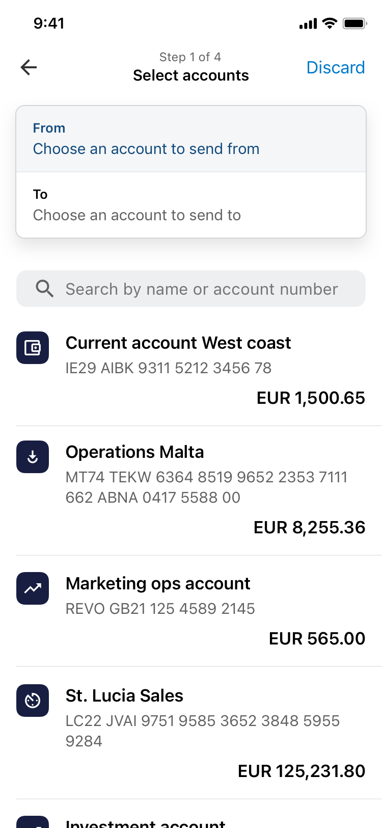
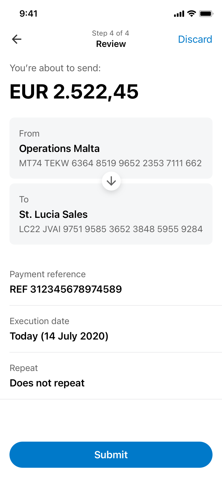
Supporting pro users
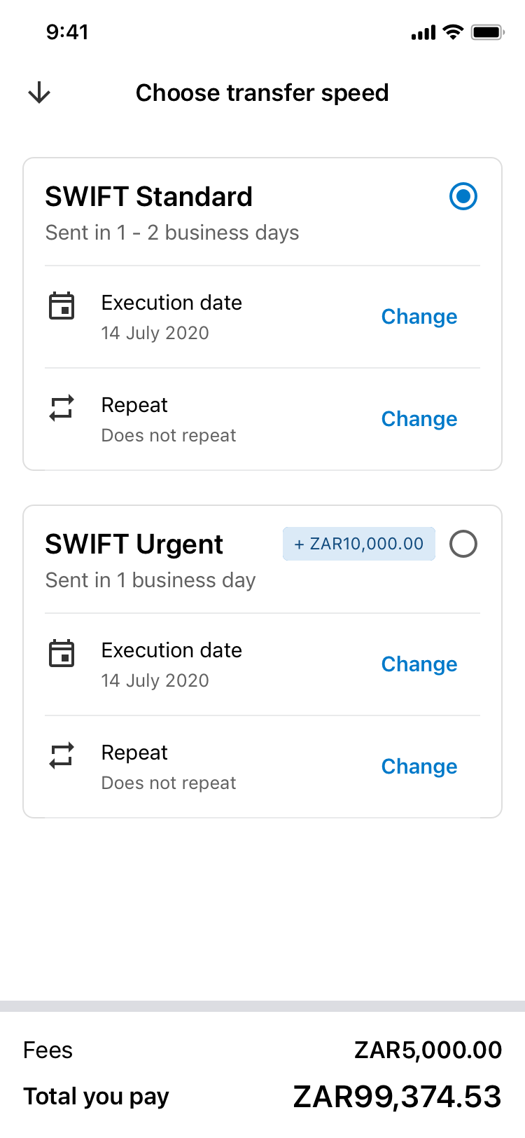
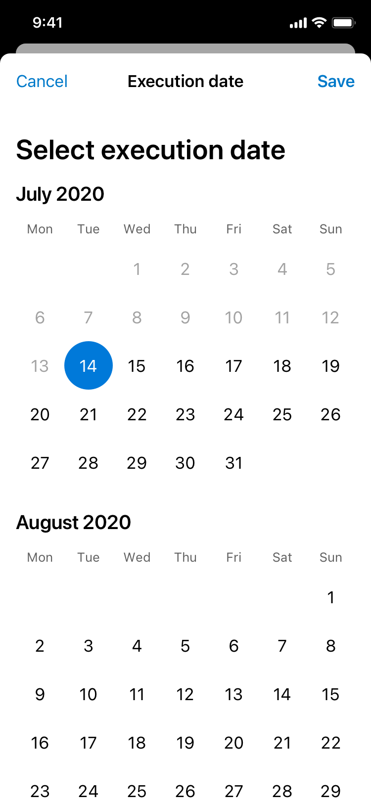
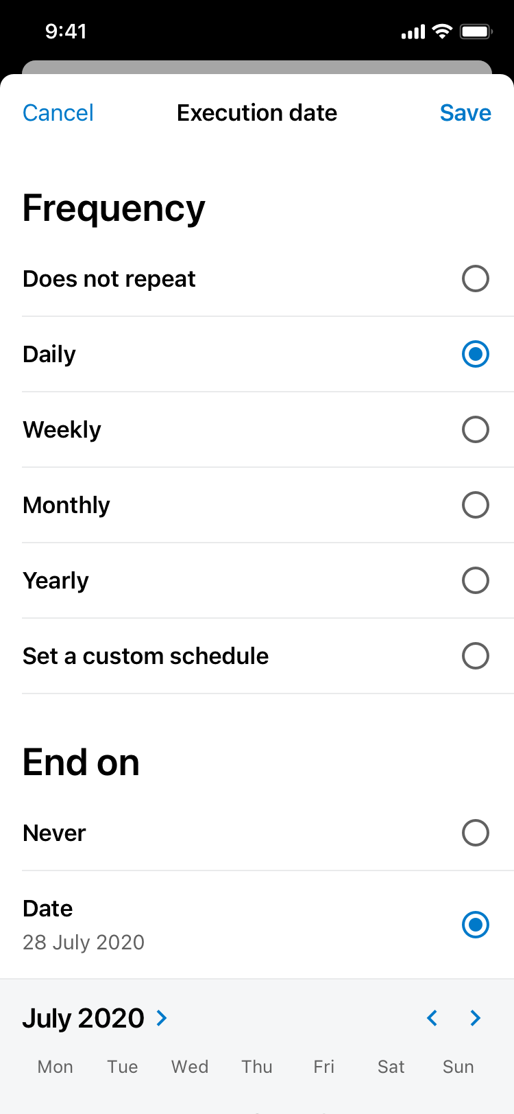
To support advanced customers who required certain amounts of customisation, we split the payments experience into two parts, core activities and advanced options. Customisation was a fork in the core payments journey. It was there for customers who needed it, keeping the experience simple, effortless and straightforward.
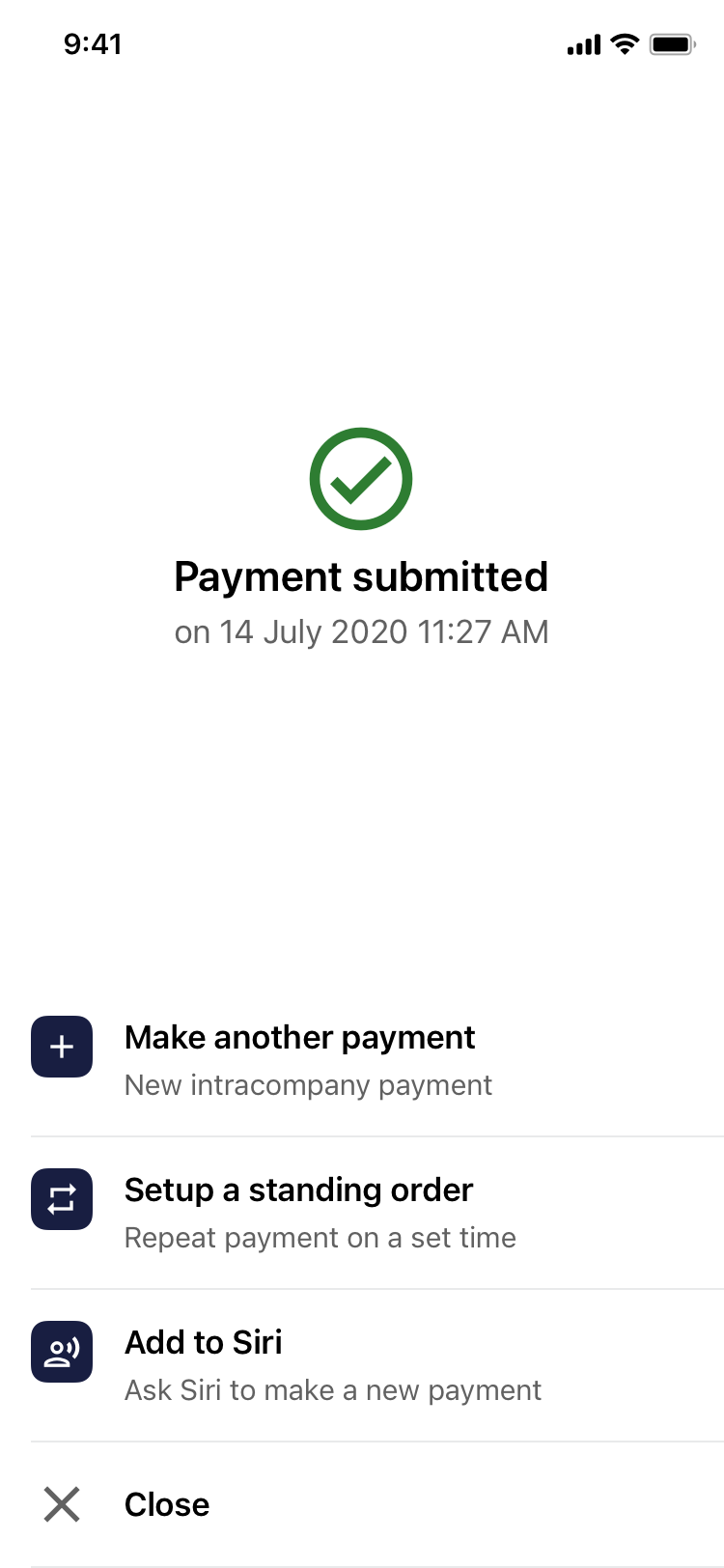
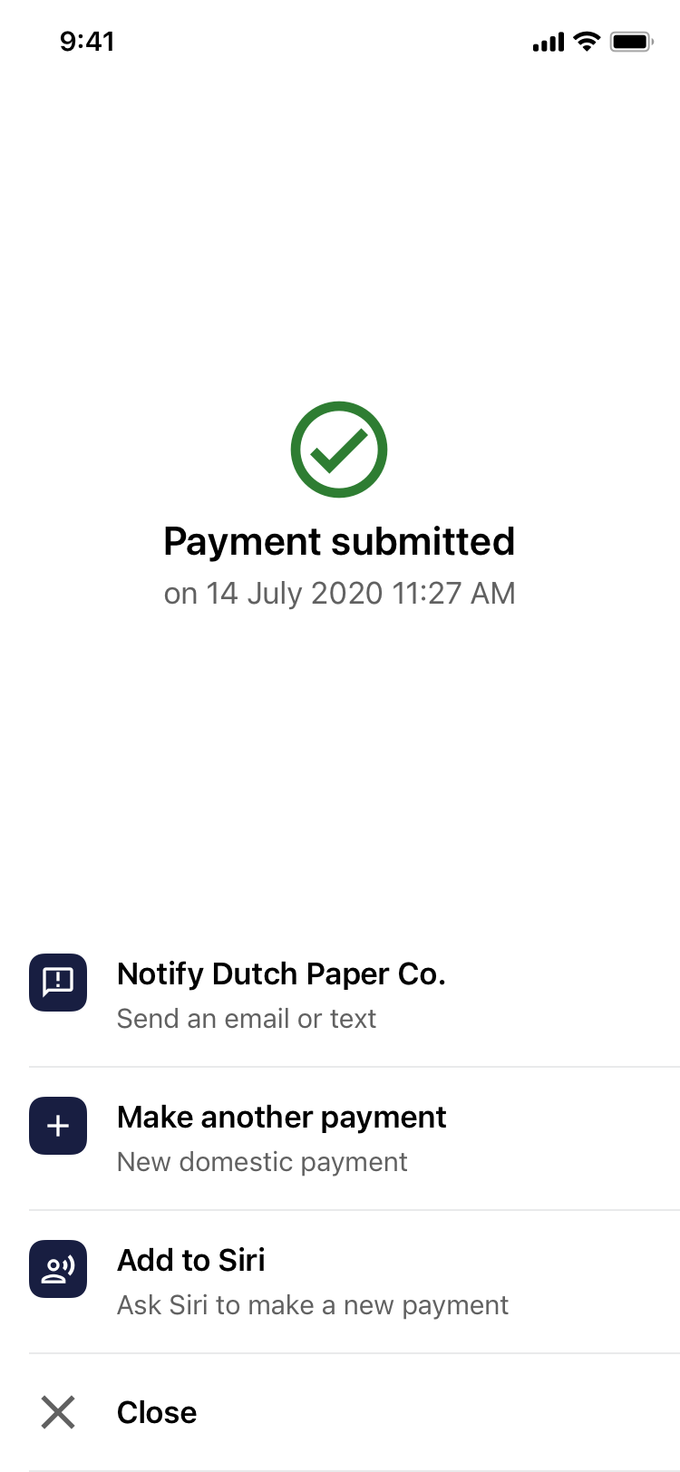
No dead ends
We designed a suggested actions stack at the end of a payment journey that allowed customers to continue easily without having to feel like they've reached a dead end or had "restart" everything again. The stack came with some sensible defaults that banks could use or they could develop their own suggested actions.
