Case study
Changing how Australians verify identity
About Australia Post
Digital iD aims to change how the Australian public thinks, uses and manages their identity and privacy of those details – online or in person. They wanted to create a paradigm shift in how people proved their identity, remove all the hurdles around that process and make them feel protected and safe in those sensitive private moments.
My role
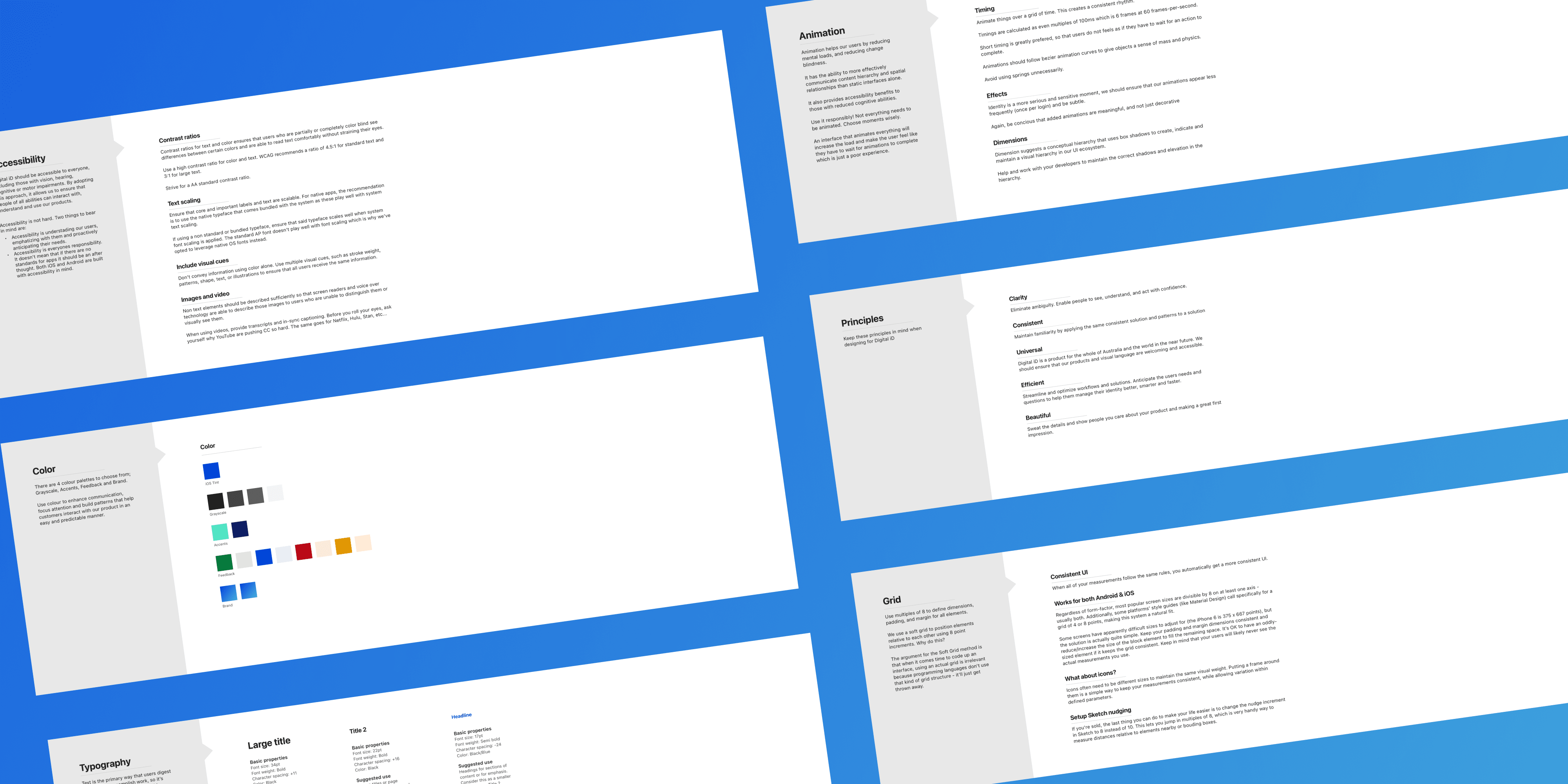
As lead product designer, I was involved in discovery, ongoing delivery, optimisations and vision work for the mobile app experience. I worked on the core identity verification framework, focusing on an accessible first experience, a reusable pattern for businesses to run their verifications and the Digital iD profile.
I was heavily involved in research activities from creating prototypes to support testing right down to helping researchers take notes and synthesise results.
Throughout my role, I helped mentor two other designers on the intricacies and patterns around mobile design.
Design responsibilities
iOS & Android design, Prototyping, Motion + transition design & Asset exports.
UX & Experience responsibilities
Journey mapping, User flows (Happy + sad paths), Information architecture, UX Writing & Accessibility compliance.
Research activities
Competitor analysis, Customer interviews, User testing + note taking + synthesis.
Team activities
Stakeholder management, Weekly critiques, UI Library creation & maintenance, Mentoring designers, Sprint planning, Refinement sessions & Retrospectives.
Tools
Sketch, Zeplin, Jira, Invision, Origami & Flinto.
Outcomes
✓✓✓ Legislated Australia wide
2000+ Profiles created in the first week
80 Average Net Promoter Score
100+ Businesses onboarded
+40% Increase in verifications for businesses
1st Government accredited identity framework
Takeaways
01.Moving beyond paper
Digital first framework
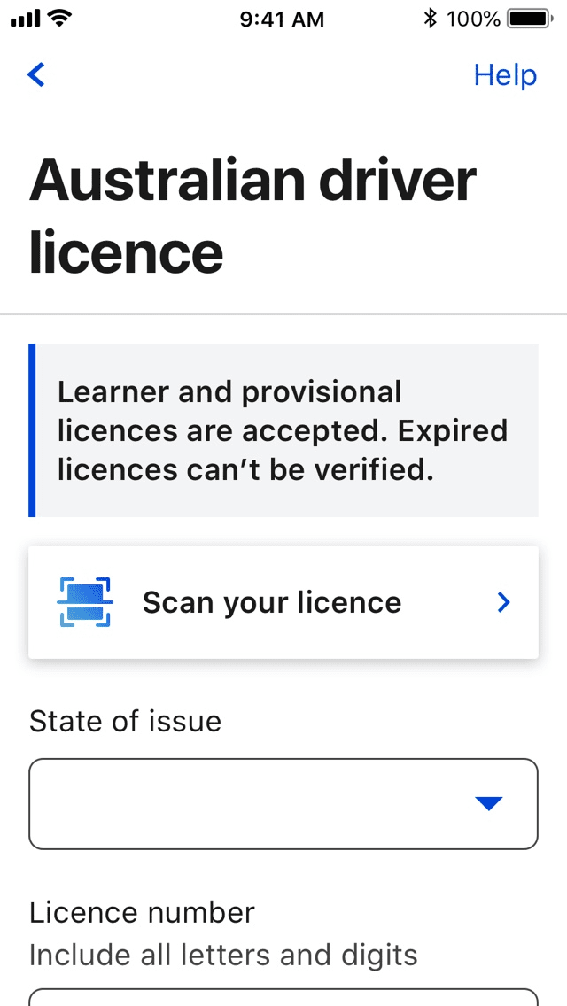
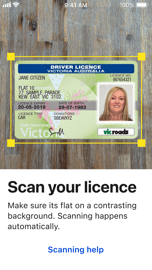
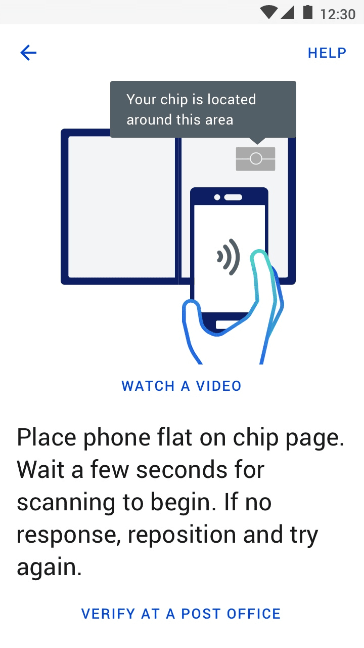
Starting with a digital form baseline, we progressively enhanced the experience for everyone based on device capabilities. Devices with cameras could scan documents to pre populate forms or verify someone in real time using video. Android devices with NFC could verify passport chips, saving customers the hassle of going in store.
Communication patterns
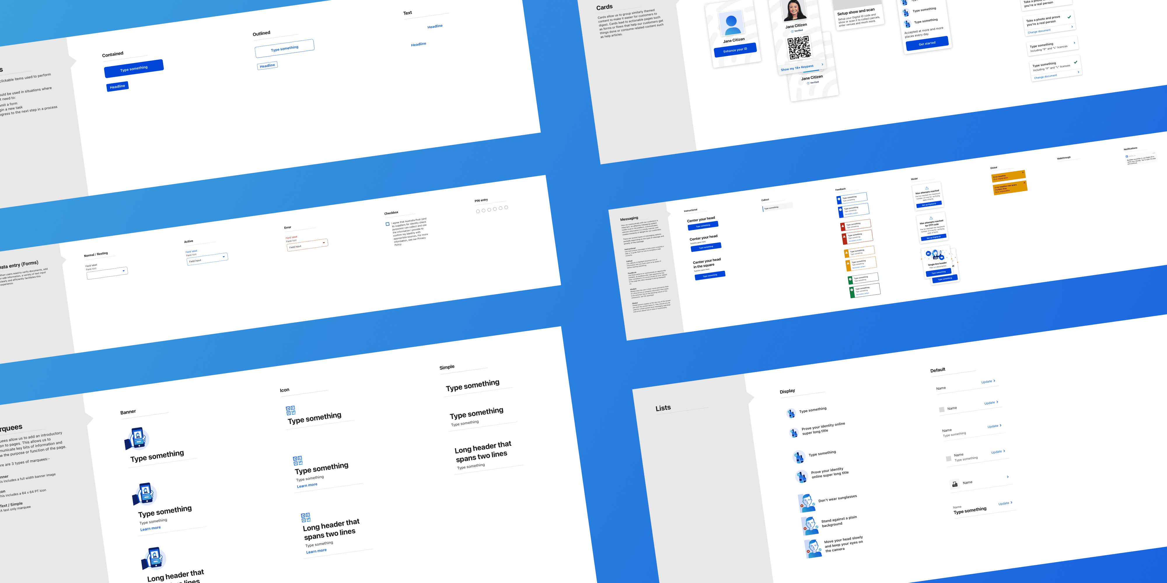
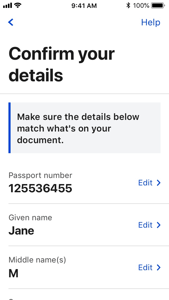
Paired with our progressive experience, we designed a suite of communication patterns to assist customers with their verification, communicate complex concepts or help with errors.
Motion as a guide
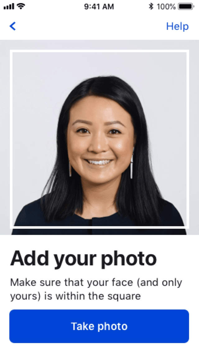
Where possible, we used motion to guide the eye, callout focus areas and delight customers. Motion really enabled us to inject some fun, create a sense of accomplishment and celebration at various milestones.
02.Connecting customers and businesses
For customers
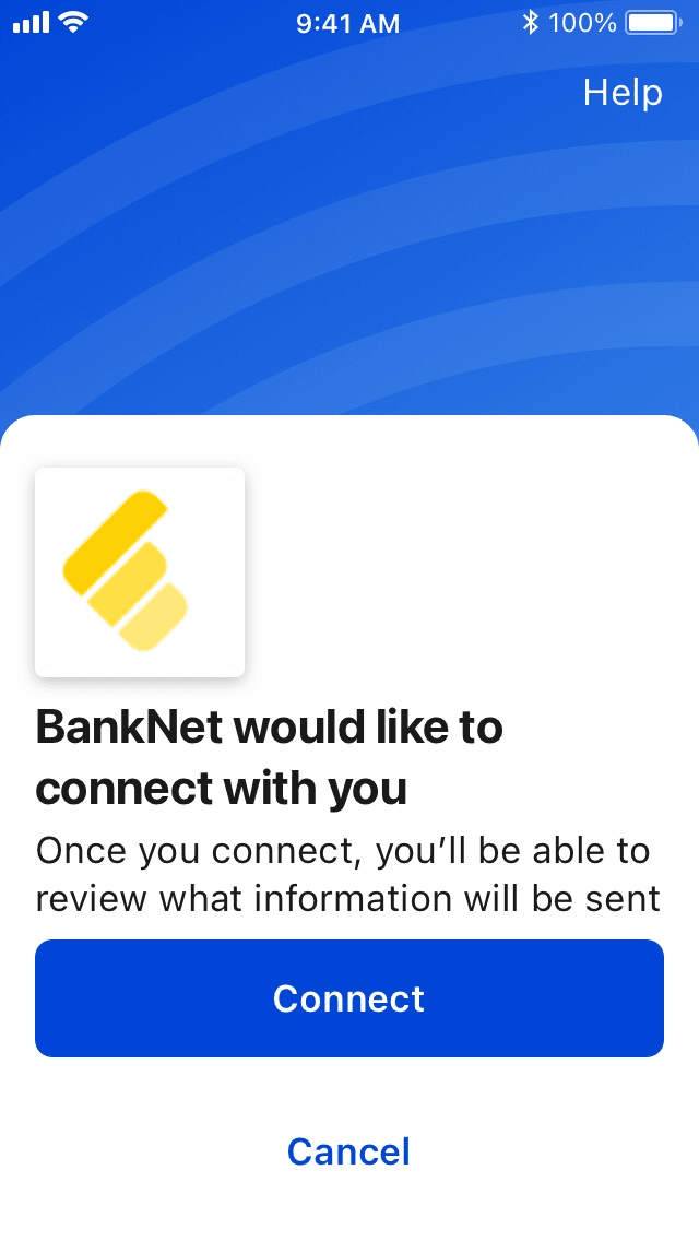
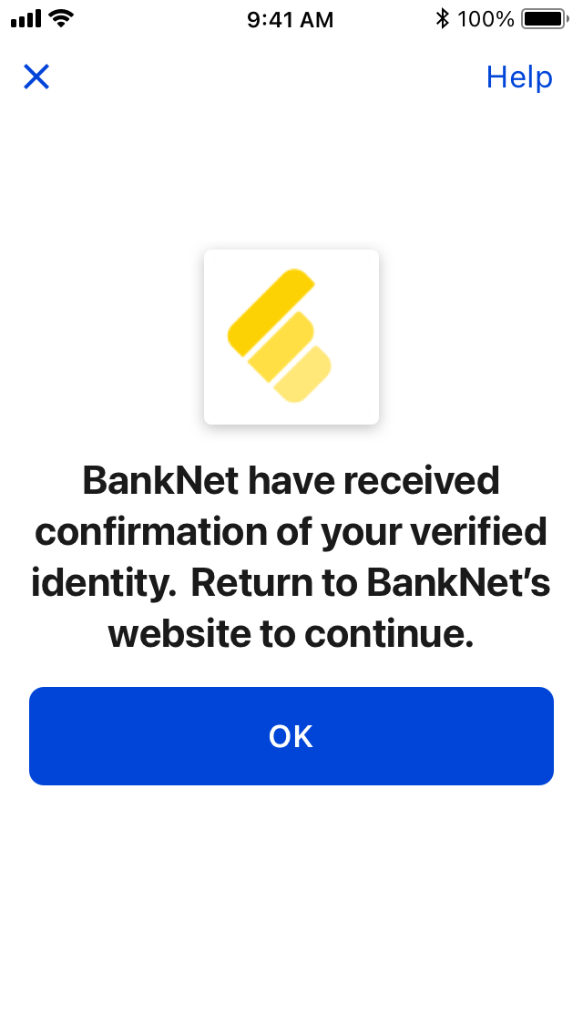
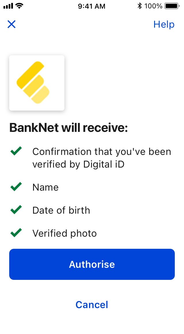
We don't have identity cards in Australia. This makes signing up for services annoying as you'd need multiple forms of ID which customers didn't always readily have. There was no privacy or transparency around what was required and how much personal information was stored either.
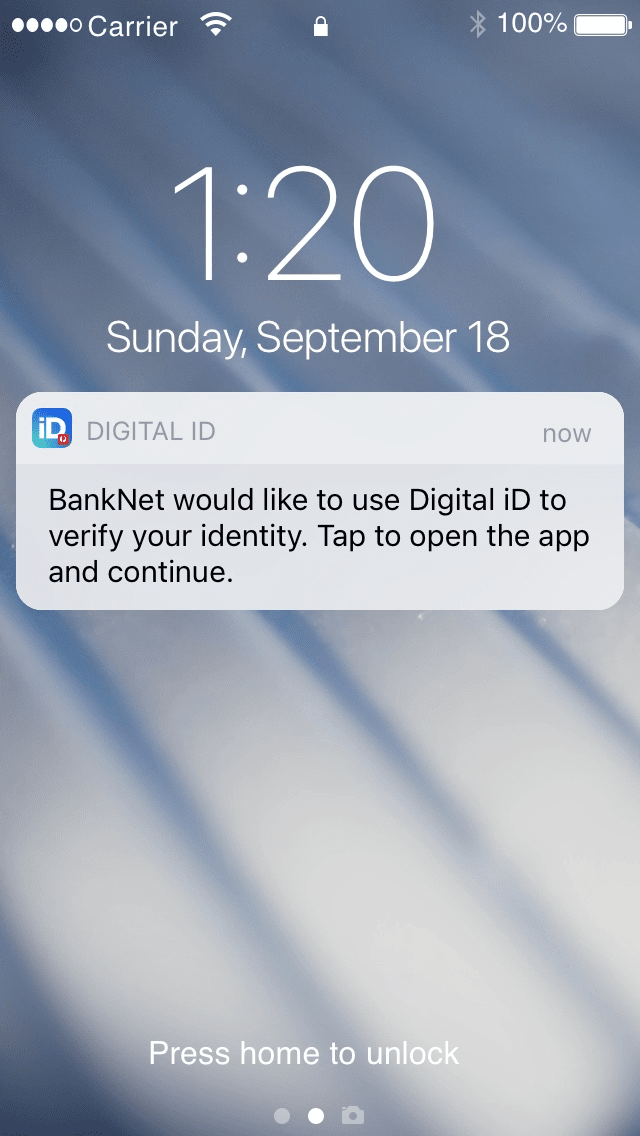
In line with those concerns, we designed a pattern focused on granting permissions for requests of personal information and clarified what was required. We only shared those required details, keeping privacy in tact.
For businesses
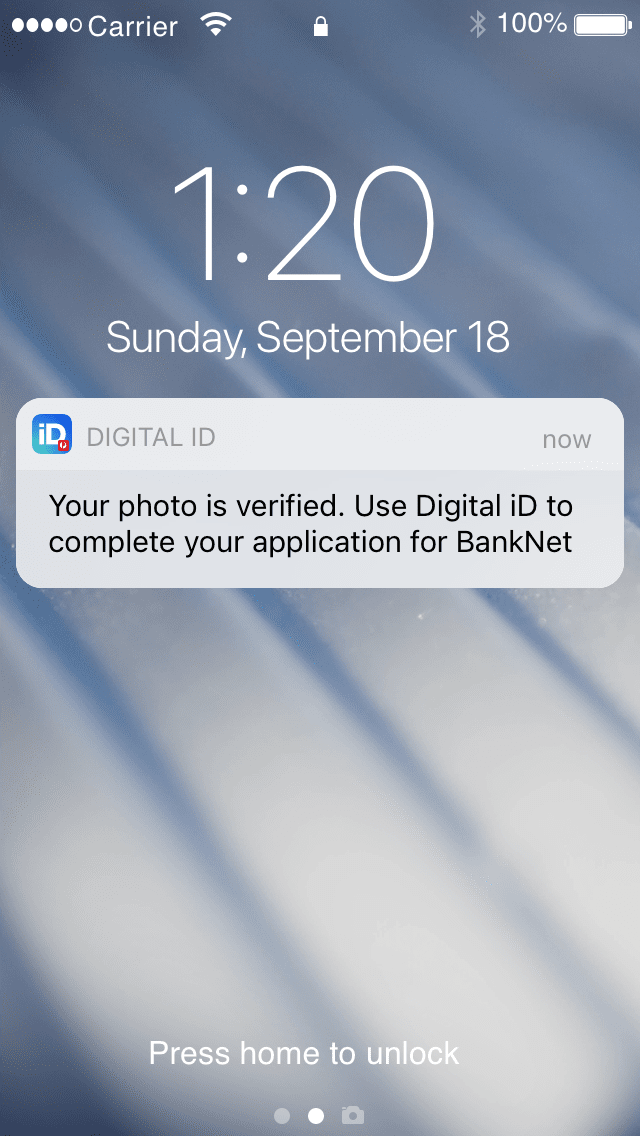
Our SDK made leveraging preset government verification standards really easy. Choose the verification level you needed and you're all set. To accompany that simplicity, we designed a stepper pattern that explained the tasks involved and what was completed.
To reduce abandonment and churn, customers could resume their verification at a later time. Useful when verification required in person confirmation or customers didn't have the required documents on them.

03.Designing for everyday moments
Onboarding Australia
Through Australia Post’s unique relationships with government agencies we were able to get Digital iD legislated and accepted as an official form of ID. Anyone could download the app to create their ID and store it securely on their phone.
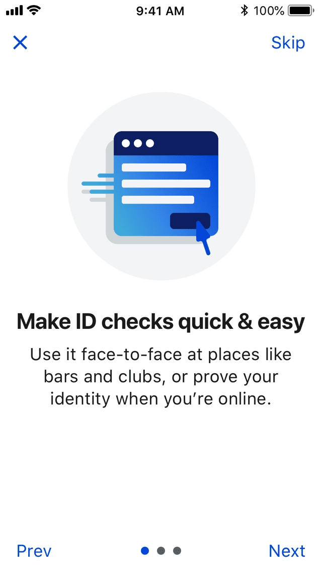
Leveraging our established UX patterns and verification tech, we crafted an onboarding experience that explained Digital iDs use and guided them through the process of setting up their Digital iD on their phone.
Increasing confidence
Drawing inspiration from physical IDs, we designed a moving hologram using our brand mark and allowed anyone to verify a Digital iD by scanning the unique QR code. These interactions helped the general public and businesses to safely and confidently accept Digital iD.
04.Galvanising the team
Rallying around a cause
Internally we had a product vision and knew how it paired with our roadmap and plans for growth. This was the perfect moment to rally the team around a refresh, which we put aside being in delivery mode for a while. It also had a nice bonus of saving the business money in external services.
Bringing different disciplines together allowed us to divide, conquer and fostered a closer knit team with collective ownership.
Stronger critiques
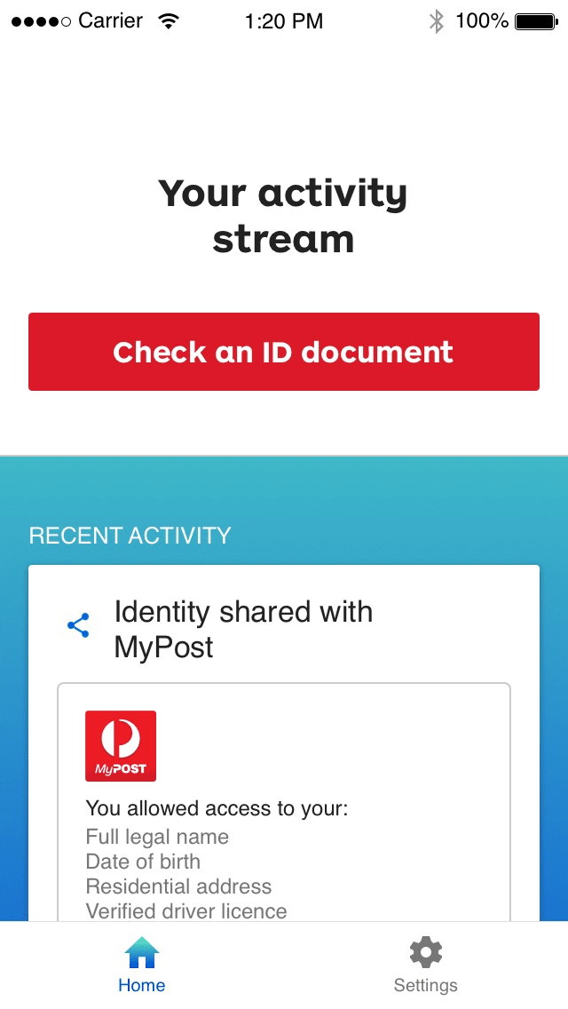
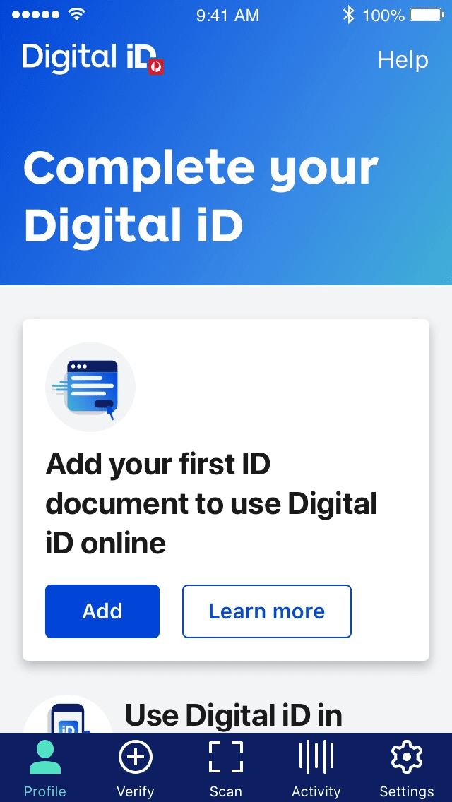
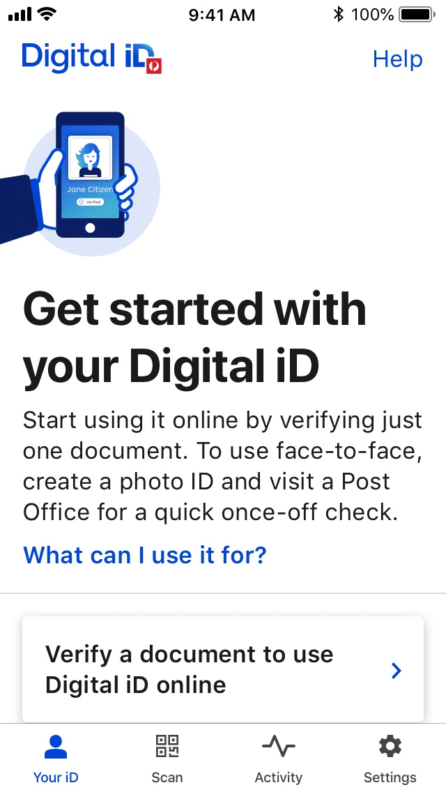
With a refresh underway, it was the perfect opportunity to strengthen our design critiques. Using experience principles to guide us, we exchanged feedback each week as we iterated on tone of voice, illustration styles, motion and experience flows.
