Case study
Australia's favourite place to shop
About Catch of The Day
Towards the end of 2013, Catch noticed a shift in their customers – they were mobile and constantly shopping on the go. Picking up on this trend, they decided to focus their efforts on acquiring and pushing more customers towards their mobile app. This meant adopting a mobile and customer first mindset and focusing on delivering the best mobile shopping experience to their customers.
My role
Starting as a consultant and then becoming the in house product designer, I worked in close collaboration with product, engineering & operations teams to learn how the business functioned and identify user pain points.
Focusing on continuous improvement of the core shopping experience, I established key areas of focus that balanced user needs, product strategy and company growth plans.
Working from the ground up, we used regular cadence testing coupled with product metrics to guide our continuous improvement, and research for larger discovery pieces to guide new features.
Design responsibilities
Responsive web, Email, iOS & Android design, Prototyping, Transition design & Asset exports.
UX & Experience responsibilities
Wireframing, User flows (Happy + sad paths) & Information architecture.
Research activities
Competitor analysis, Survey creation + synthesis, Unmoderated testing + synthesis.
Team activities
Stakeholder management, UI Library creation + maintenance & Component specifications.
Tools
Adobe Photoshop + Illustrator, Sketch, Zeplin, Pixate.
Outcomes
+30% Average order value
-15% Cart abandonment rate
70% Sales were app driven
-8% Order related complaints
4.85 App Store rating
Takeaways
01.Focusing on the core experience
Browsing
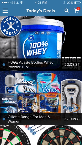
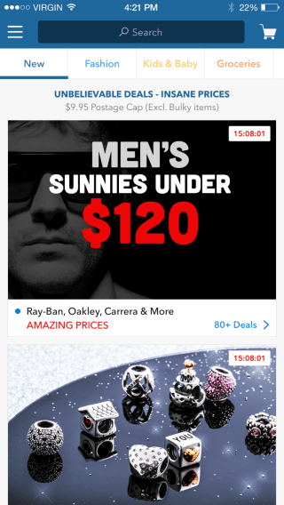
Data available revealed where customers dropped off, their funnel behaviour, how far they scrolled and where they were looking. Paired with exit page surveys, we pieced together a pattern of high bounce rates due to a lack of categorisation of sales events.
To make movements between category and child pages easy, we used transitions to make the entire browsing experience slick.
Filtering
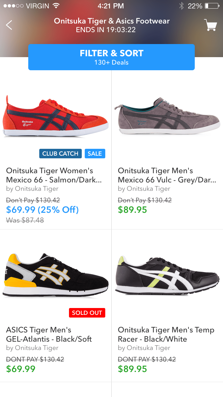
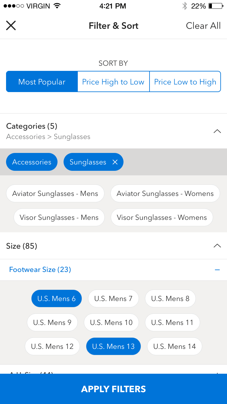
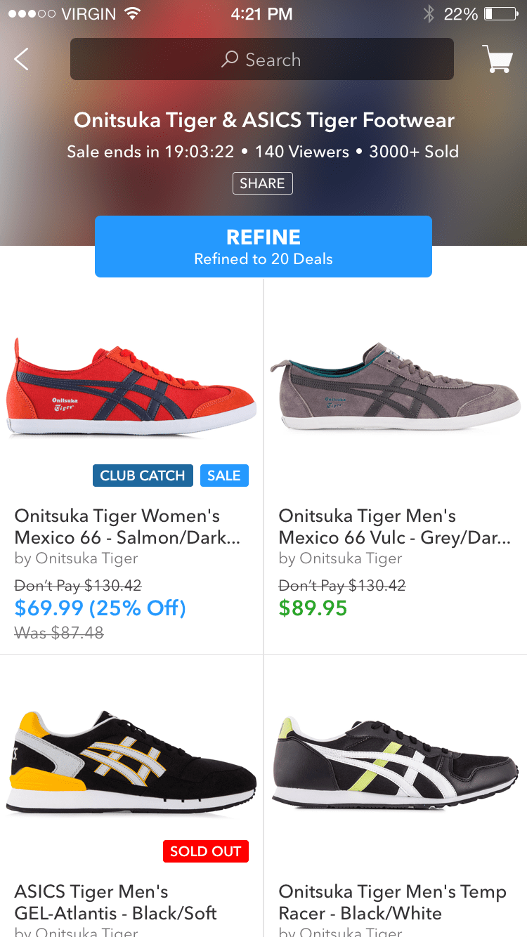
Looking at search data, terms and paths customers took, revealed they were looking for better ways to locate products. With middle layers pulling categorisation data, we enriched those services to return sub categories and product attributes.
We made filtering easy by auto-magically returning relevant sub categories and attributes based on a selection — allowing them to find products more efficiently and purchase quickly.
Checkout
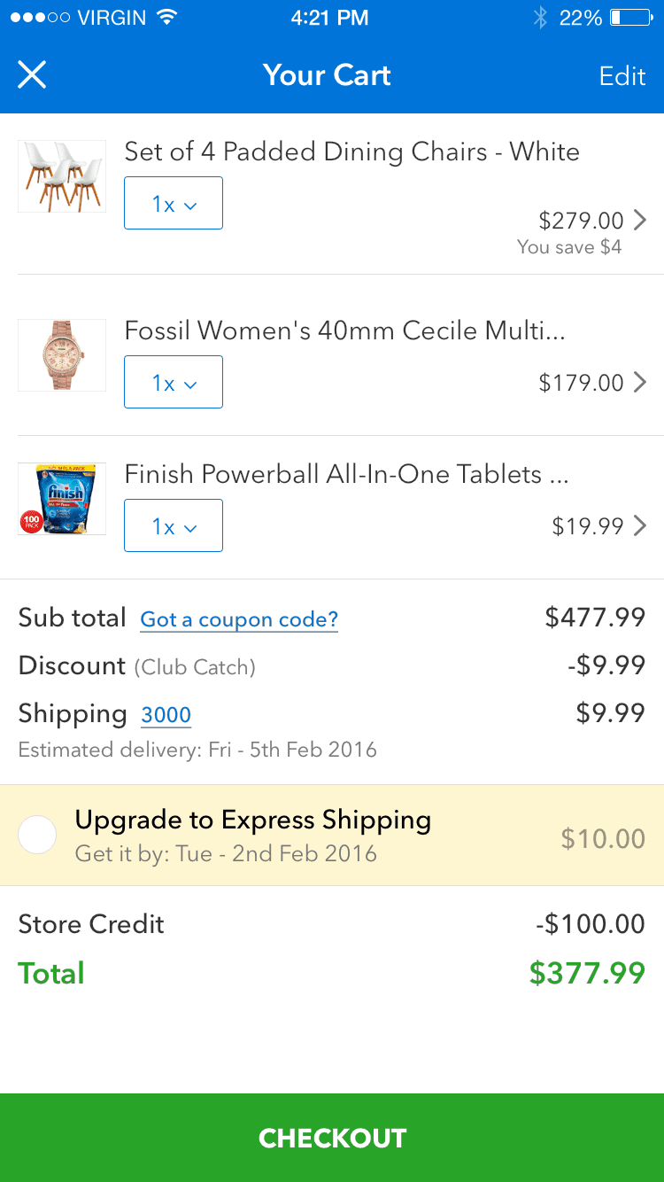
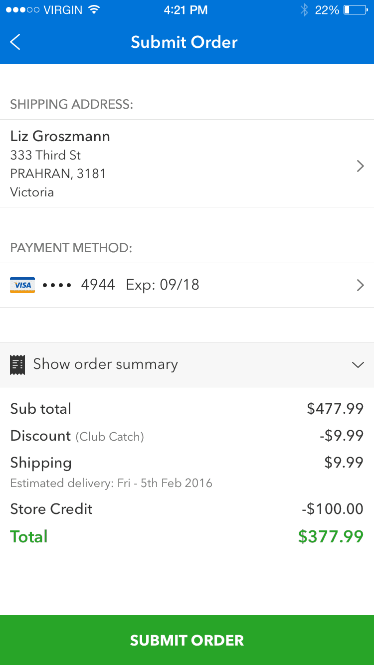
Observing customers in remote sessions and using customer service insights revealed areas concerns customers had checking out. The theme here was clarity. Keeping things simple, not overwhelming customers and making them feel confident when checking out.
We prioritised parcel splits, estimated shipping costs, discounts applied and store credit deductions.
Managing orders
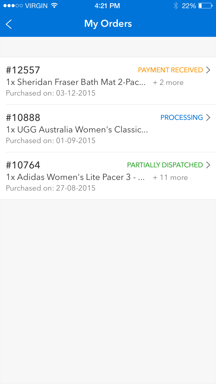
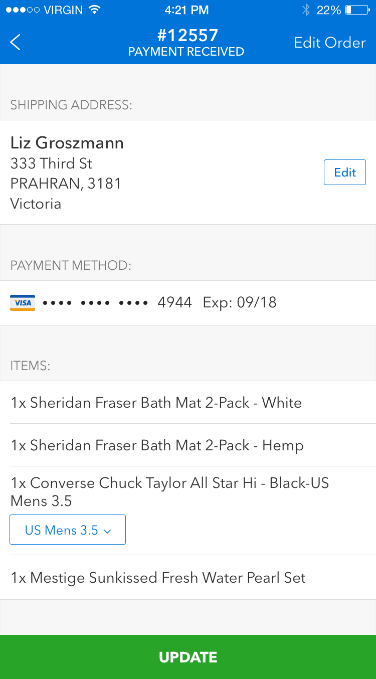
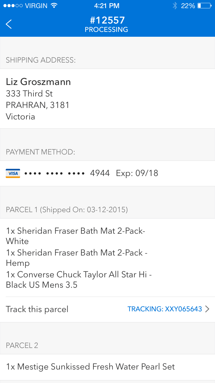
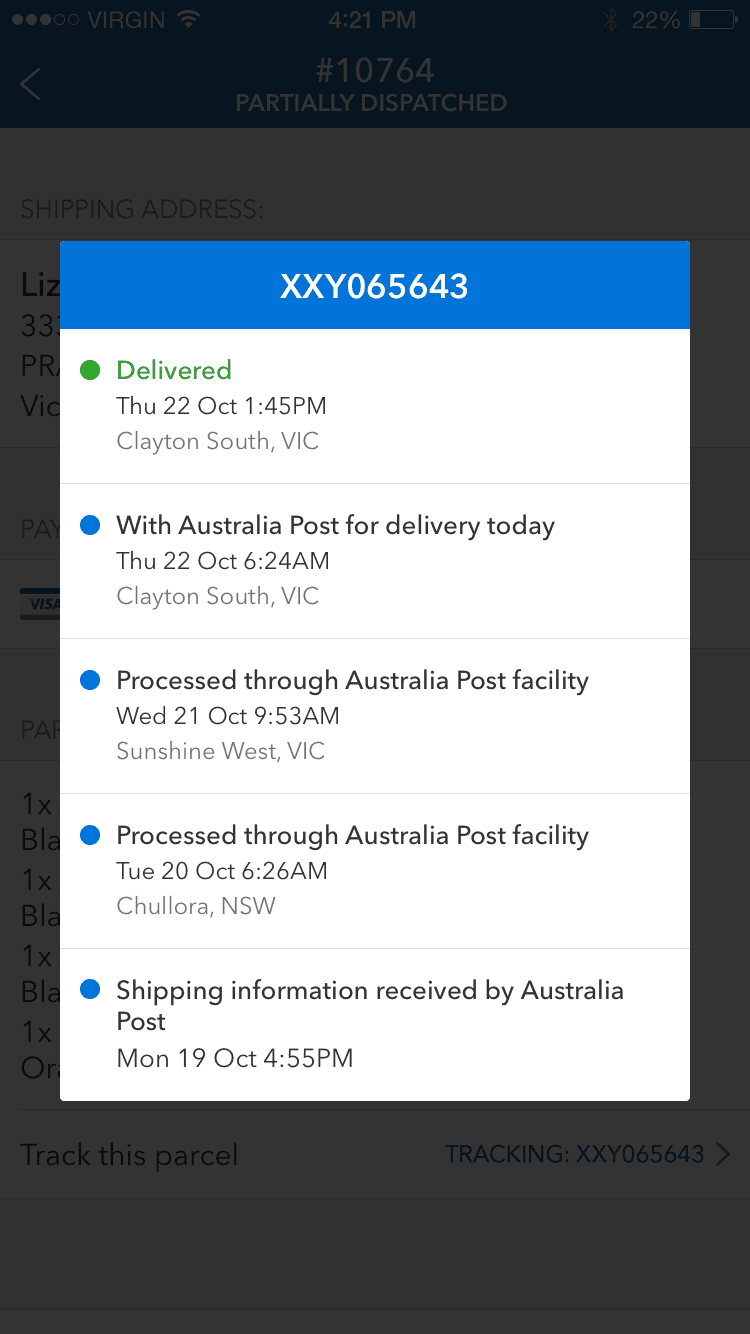
Customers wanted the ability to change an order or shipping address due to a purchasing mistake and they were frustrated with a fragmented tracking experience. These issues resulted in a high volume of calls to customer service and decreased customer satisfaction.
Creating a hub for order history with order status and tracking events reduced the volume of support calls for this pain point.
Returns
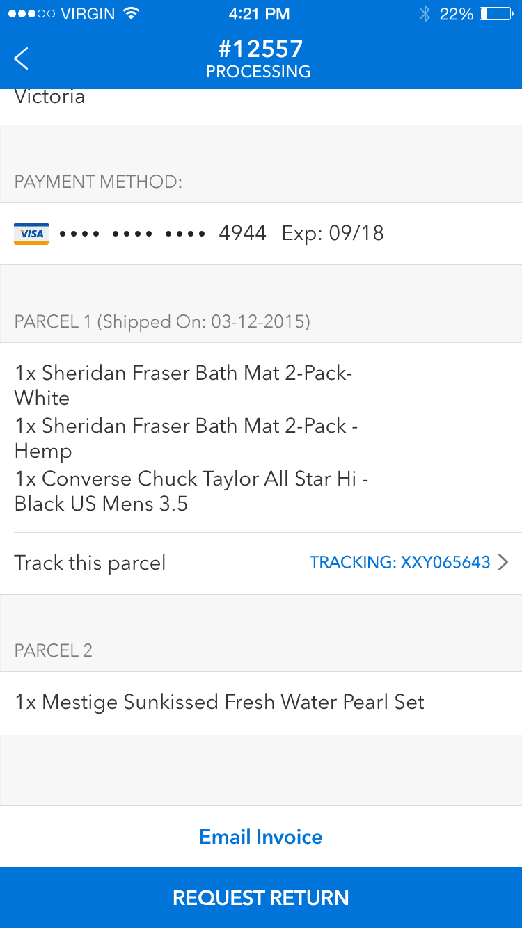
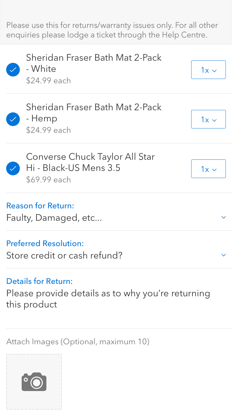
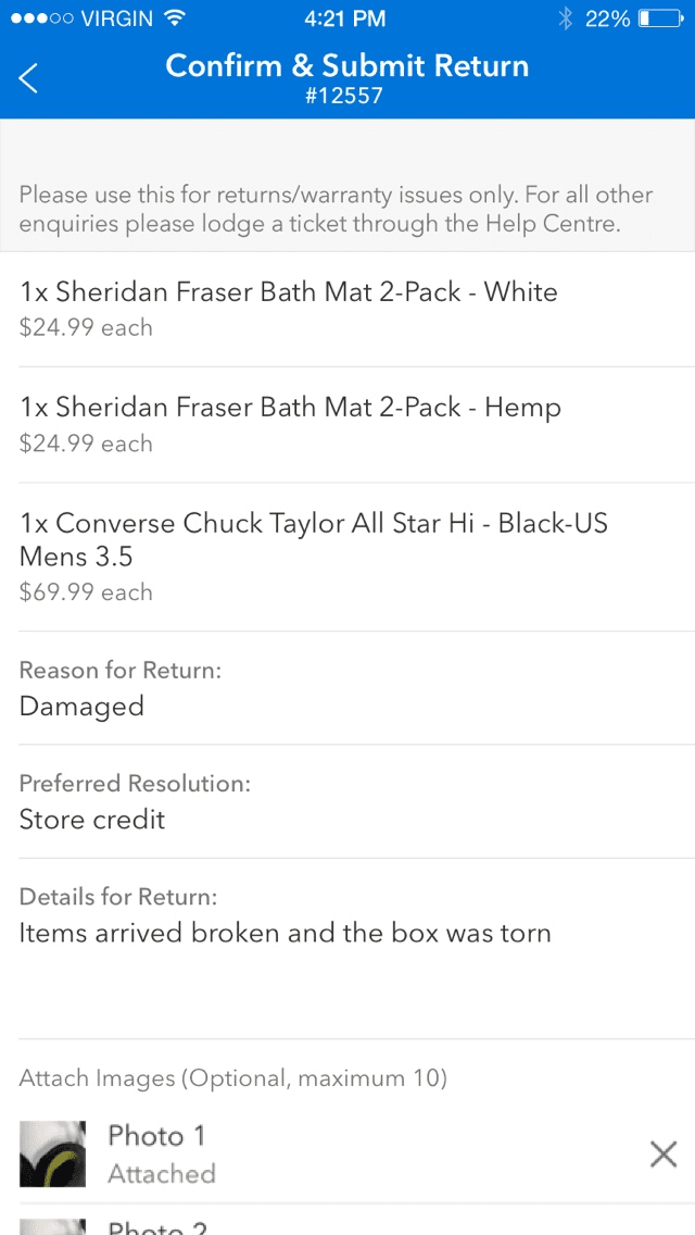
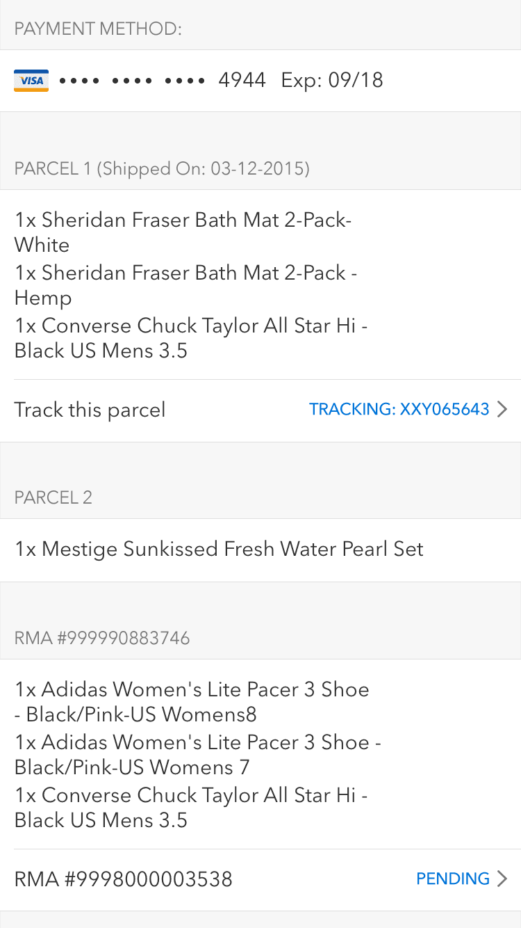
Initiating returns wasn't a straightforward process. Customers would return products only to find out there were still steps left to finalise the return and customer service were also struggling resolving incomplete returns.
Working with customer service we digitised the process and used the device camera to assist customers with proving faults. Customers could initiate returns efficiently and customer service could turn around returns quicker.
02.Growing through subscriptions
Prime just enough
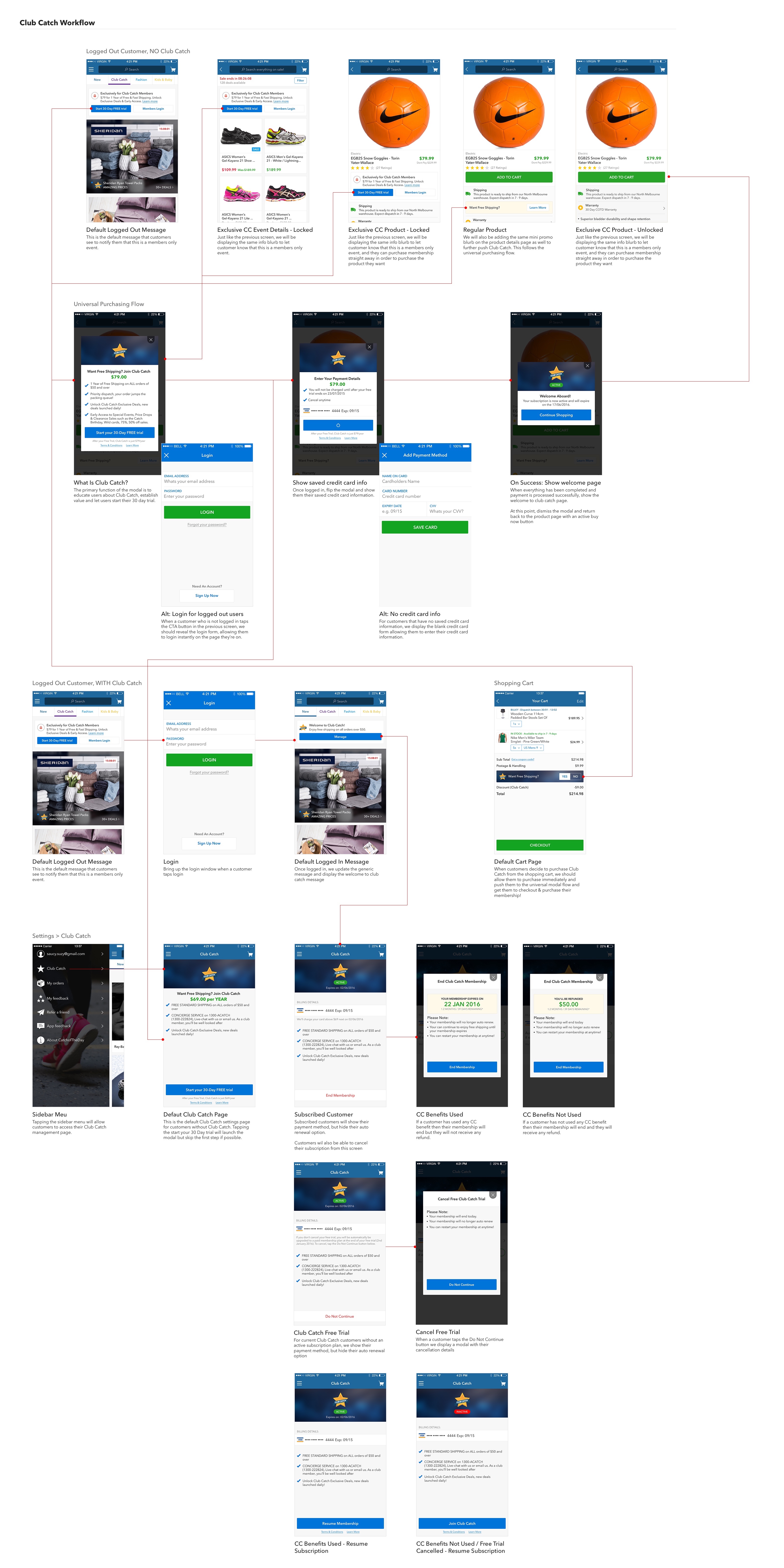
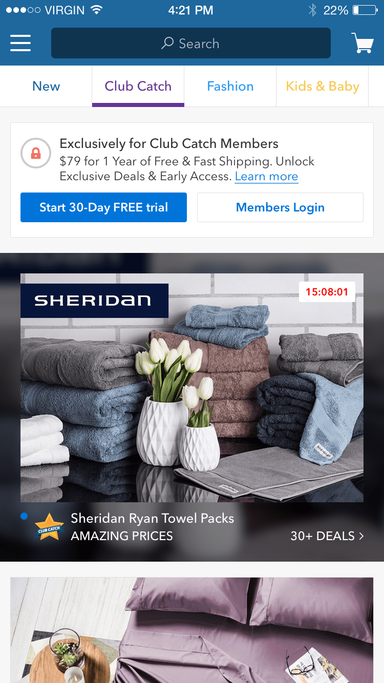
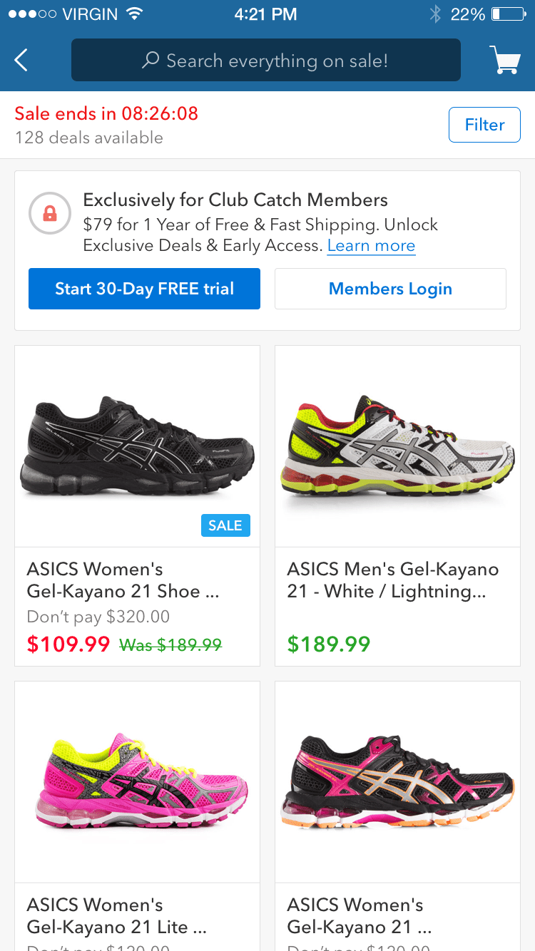
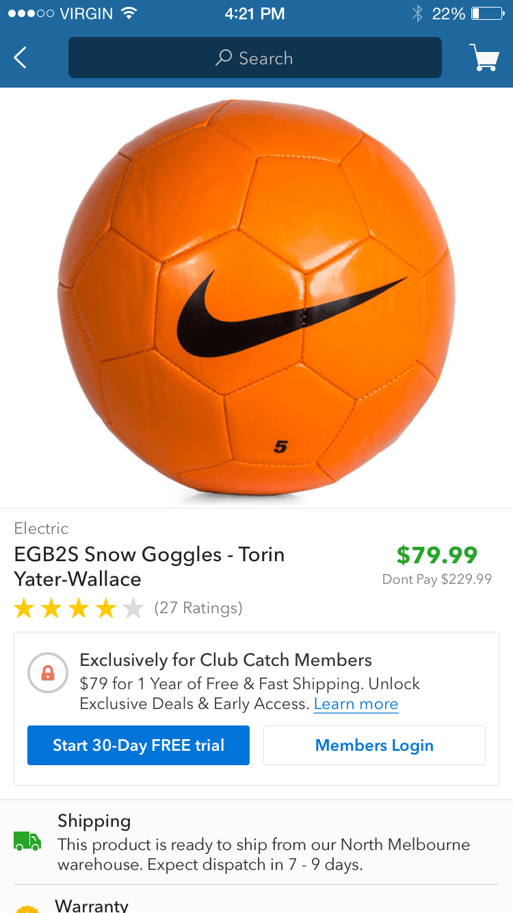
The value proposition of subscriptions were rewards, free shipping, exclusive deals and special access to sales events. Relying on a subtle approach while we measured growth, we used a generic component that could slot in different sections, enhanced easily and allowed for A/B testing of the value proposition.
Minimise disruption
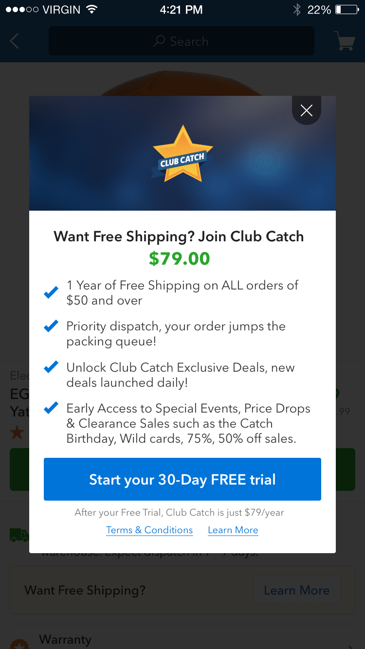
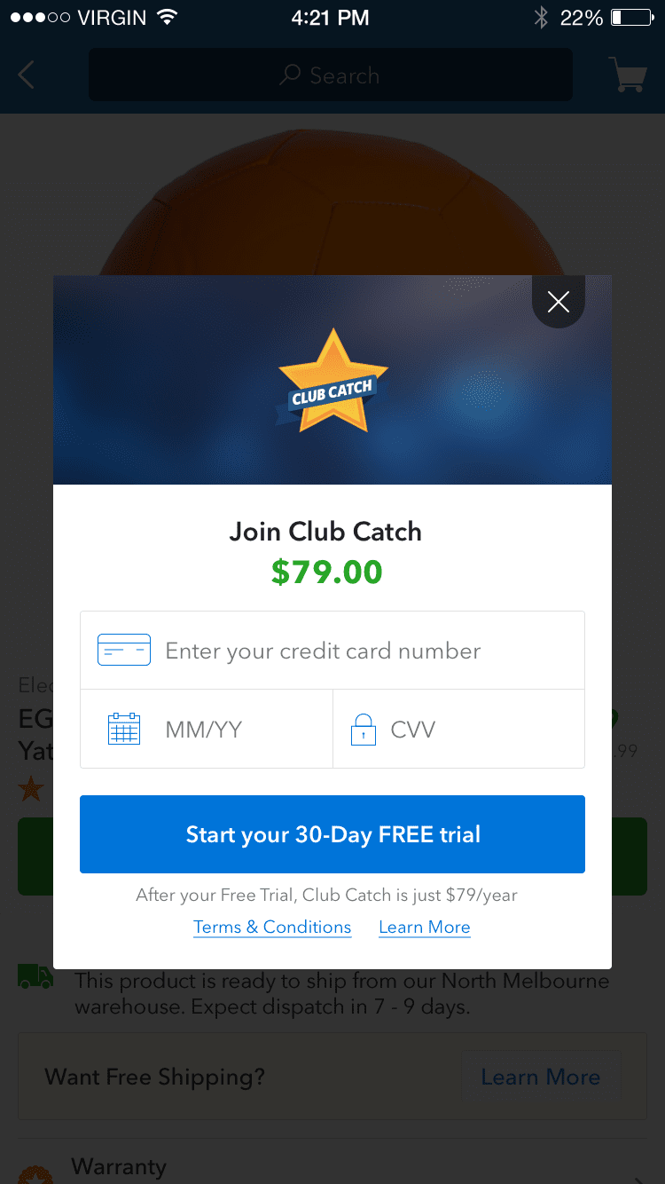
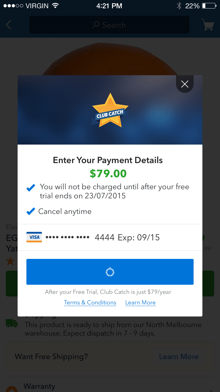
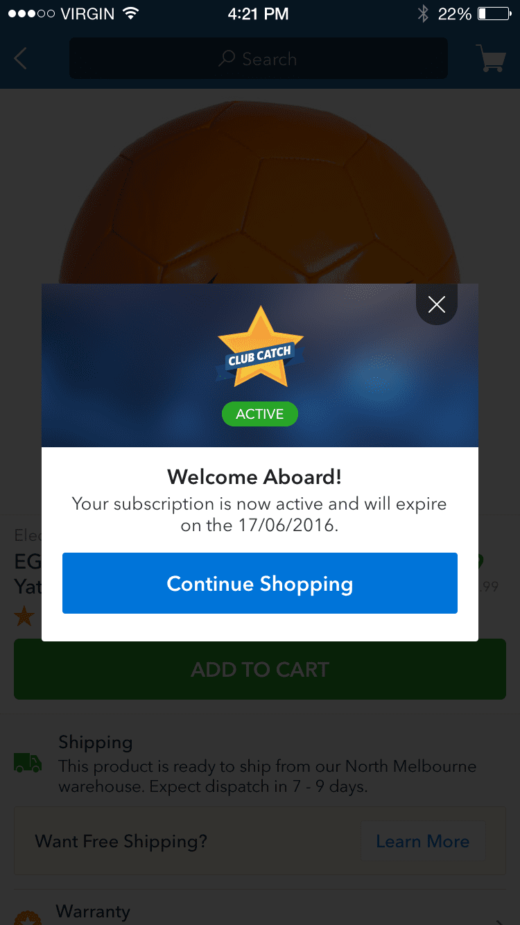
Once primed, we wanted to efficiently introduce the program to customers and onboard them with as little disruption to their shopping as possible. The idea was to onboard them, let them continue shopping and reap the benefits immediately.
Simple management
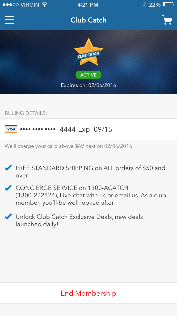
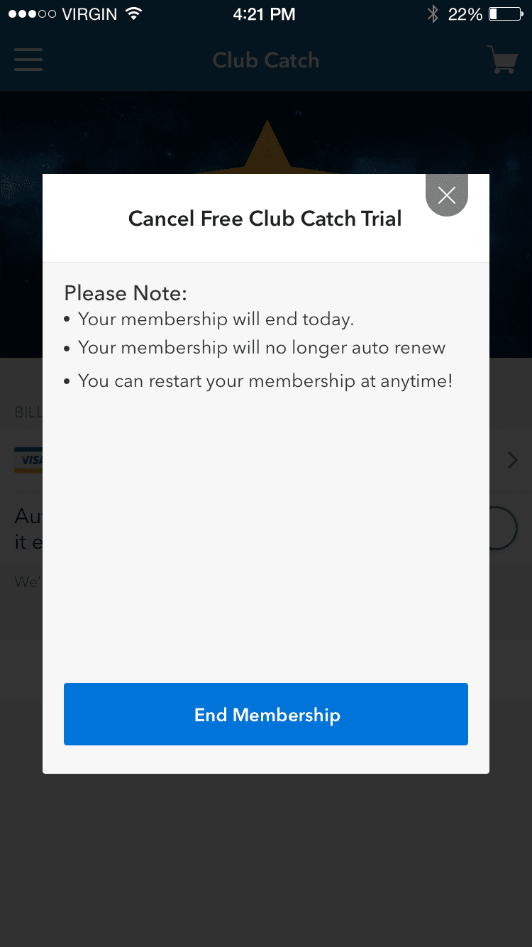
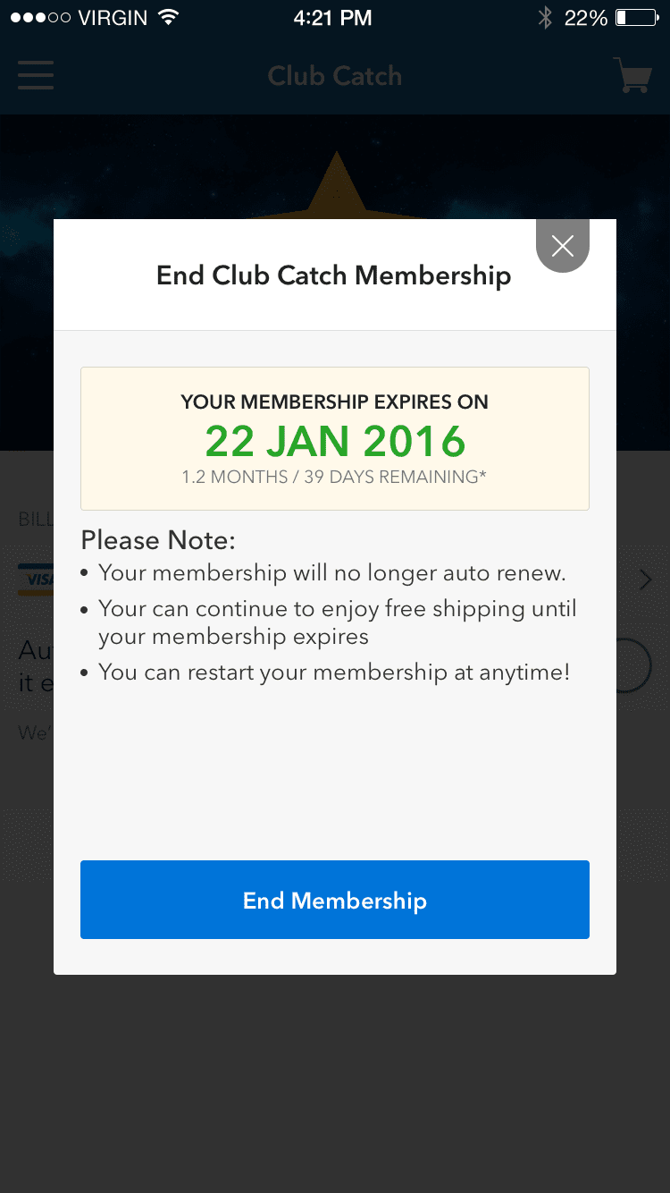
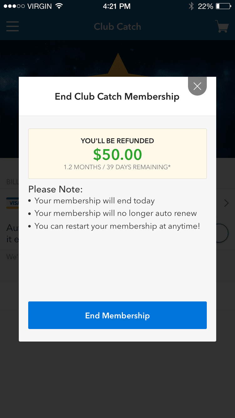
Keeping customers in control of their membership, we created a hub that clearly communicated the status of their membership, renewal dates and any refunds applicable upon cancellation.
03.Smooth handoff
UI Library
As the company grew and delivery intensified, it was paramount that engineers could have a reference for consistency and a sticker sheet for icons. I created style guides for the engineering teams and specced out components to ensure accuracy in implementation.
